Create Stunning Custom Visuals in Tableau

How can I enhance the appeal, dynamism, relevance, and reception of my data visualization to engage diverse audiences? Whether you’re a novice or experienced data analyst, these inquiries hold paramount importance as you aspire to achieve excellence in your visualizations. Well-executed visualizations have the power to convey captivating narratives and unveil concealed insights and intricacies that may elude traditional spreadsheet, bar chart, or pie graph formats. Before delving into the specifics, consider your visualization’s objectives and the desired impact it aims to make. Reflect upon the following questions:
- Who comprises my audience?
- What inquiries do they seek answers to?
- What insights am I providing them with?
- What message am I conveying?
- How might my visualization inspire additional questions or foster meaningful discussions?
Once you’re prepared to embark on the creative journey, employ the following tips and techniques to make your visualization intuitive, captivating, and easily comprehensible. By doing so, your intended messages will resonate clearly, allowing viewers to extract specific and valuable insights.
Choose the right charts and graphs for the job
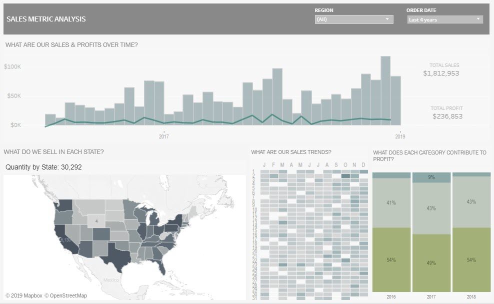
Choosing the right visualization format is crucial as there is no one-size-fits-all approach. It is essential to carefully consider the format that will effectively convey the story and address the key questions arising from the data, aligning with your overarching purpose. In some cases, combining related charts can be advantageous, stimulating deeper exploration and uncovering valuable business insights that drive actionable outcomes. Let’s explore some popular formats:
- Bar charts are excellent for comparing categories within a single measure, making them one of the most widely used data visualizations. They shine when you need to analyze data that can be divided into multiple categories.
- Bullet charts offer a visual representation of progress towards a goal by comparing different measures. They were specifically designed as alternatives to traditional dashboard gauges, meters, and thermometers.
- Line graphs connect distinct data points, presenting them as a continuous evolution. They provide a simple and straightforward way to visualize changes in one value relative to another.
- Histograms and box plots depict data clustering and facilitate category comparisons.
- Maps are ideal for visualizing location-specific questions or aiding geographical exploration.
- While pie charts can add detail to other visualizations, they are not as effective when used alone. In fact, on Pi Day (March 14) each year, data scientist Kaiser Fung and his colleague seek out pie charts and recreate them into more suitable versions, protesting against their rampant overuse.
By carefully selecting the appropriate visualization format, you can effectively convey your message, unlock insights, and ensure meaningful data-driven actions.
Use predictable patterns for layouts
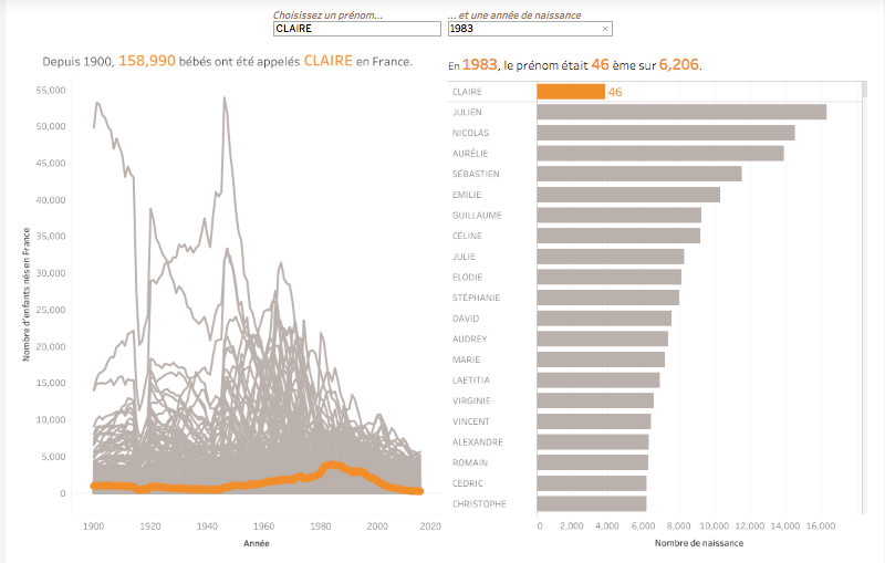
As inherently visual beings, humans are naturally inclined to seek out and interpret visual cues that provide us with crucial information at a glance. Our minds instinctively search for patterns, and when these patterns are random or lack coherence, comprehending the message conveyed by a visualization becomes exceedingly challenging. To leverage these innate tendencies, it is vital to ensure that the order and format in which you present data make logical sense to your viewers, be it numerical, alphabetical, or sequential.
Consider a straightforward example: if you are communicating in a language that reads from left to right, it is advisable to orient your visualization accordingly, respecting this convention. When utilizing multiple graphs, maintain consistency in their order and establish clear connections between the data. It is essential to prevent your audience from getting lost as they swiftly and effortlessly navigate from one point to another.
By aligning your data presentation with human cognition and employing a cohesive visual structure, you empower your viewers to grasp the intended message efficiently and effectively.
Tell data stories quickly with clear color cues
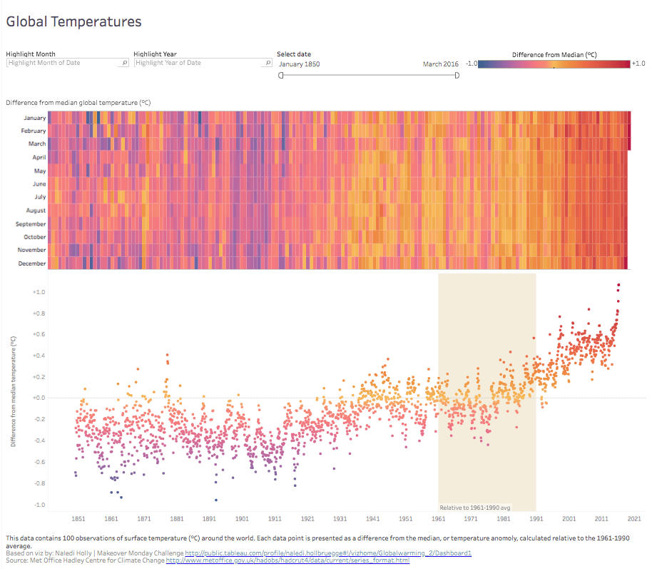
The role of color in data visualization cannot be overstated. It possesses the ability to communicate a wealth of information without the need for words. However, there exists a delicate equilibrium when it comes to employing color effectively; simplicity is key. Utilize color to draw attention to and emphasize the essential information. Overloading your visualization with an abundance of colors can create a chaotic and overwhelming effect, while relying solely on a single color or numerous shades of one color can cause the data to blend together.
Moreover, the association of colors holds significance. Opt for intuitive colors that resonate with the viewer, enabling them to process the information more swiftly. For instance, when representing temperatures, utilize red to signify heat and blue to depict cold. Additionally, the strategic use of colors can have a substantial impact. Demonstrating consistency across values or employing contrasting colors effectively highlights variations within the data.
By understanding the nuances of color application and striking the right balance, you can leverage its power to enhance the clarity and impact of your data visualization, facilitating a faster and more intuitive comprehension for your audience.
Incorporate contextual clues with shapes and designs
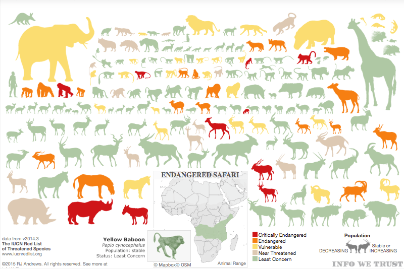
Providing context enables us to quickly comprehend information without the need for meticulous examination. The use of visual shapes corresponding to the subject matter can effectively convey a captivating narrative. Take, for instance, the illustrated chart showcasing endangered species in Africa. In a single glance, we can grasp which animals are at risk and gauge their level of vulnerability. By opting for animal silhouettes instead of conventional bar charts laden with numerical values and text, we create a far more engaging and intuitive visualization that captivates the viewer’s attention and prevents them from becoming overwhelmed by the data.
Strategically use size to visualize values
Utilizing size can effectively highlight significant information and provide contextual cues. In the previous visualization, the sizes of endangered animal shapes reflected their relative magnitudes compared to one another. However, size can also serve as an indicator of scaled values. Rather than relying solely on color, adjusting the size of shapes based on data values can be a powerful approach. This technique is particularly beneficial when working with maps. When multiple data points are represented with the same size, they tend to blend together, making it challenging to distinguish between values. By making size relative to the data values and incorporating color as an additional marker, the visualization becomes easier to navigate and interpret, as exemplified in this illustration.
Apply text carefully and intentionally
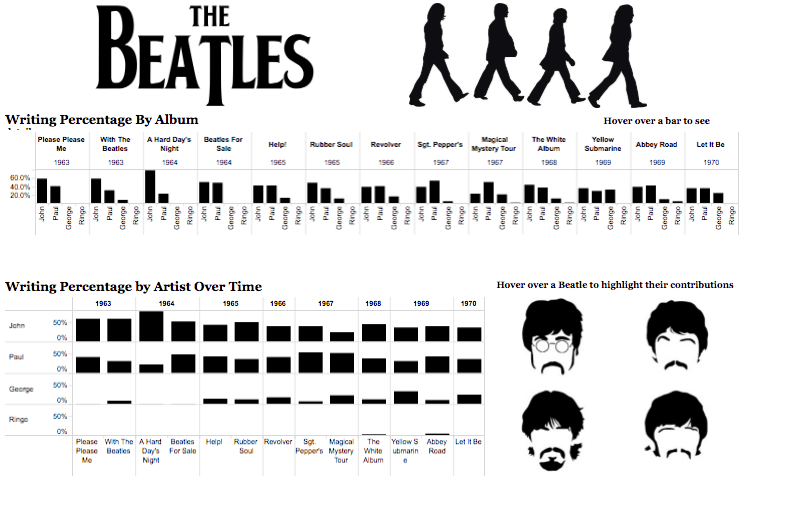
Lastly, the text you choose can significantly enhance your visualization, both in terms of the content and its presentation. While excessive or poorly organized text can be distracting, relying solely on visuals may sometimes fall short. When incorporating text, ensure that it highlights essential details, such as the individual contributions of the Beatles members to their iconic songs and albums during the peak of their fame. Although our brains are wired to process patterns and images more readily than words, strategically using text where it matters can make a significant impact. Here are a few additional guidelines to elevate your visualizations from good to outstanding:
Position the most crucial view at the top or in the upper left corner since our eyes are naturally drawn to that area first. Keep the number of views in your visualization limited to three or four. Too many views can obscure the overall picture amidst the details. If you have multiple filters, consider grouping them together. Adding a subtle visual cue like a light border can indicate that they share common characteristics. Interactivity can transform a confusing visualization into an exceptional analysis tool. You should guide the narrative, encourage exploration, and when implementing interactivity, ensure that viewers are aware they can actively engage with it, possibly by providing subtle instructions.
By applying these principles, you can enhance the effectiveness and engagement of your visualizations, enabling viewers to extract valuable insights with ease.
